Research
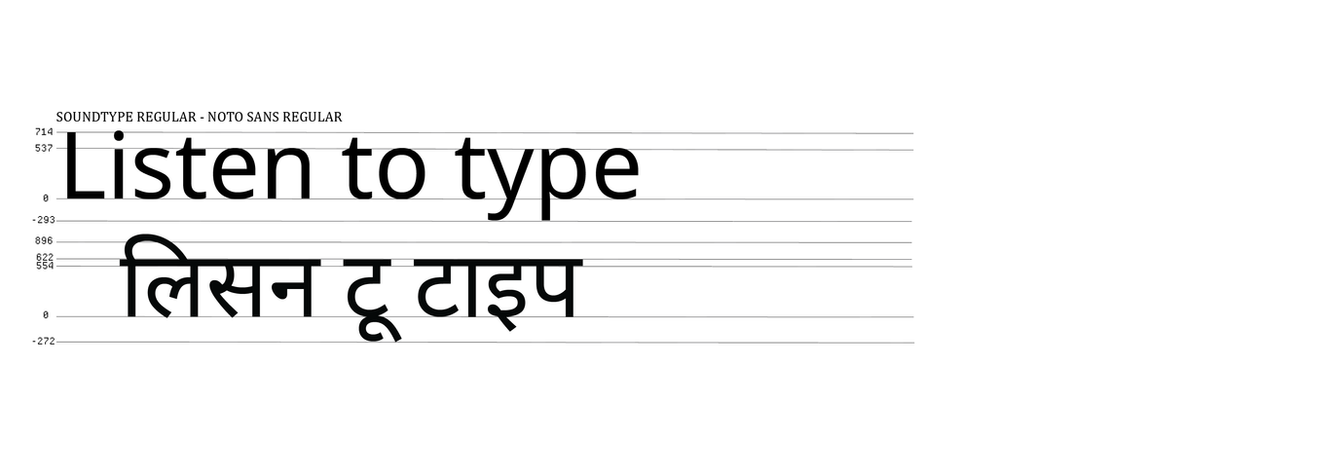
Frequency Of Steps

Loudness → Bold Weight + Large Size + Uppercase Increased stroke thickness (bold weight) and point size combined together to show a strong and a dominant presence of a loud voice. Uppercase letters well known as “shouting” in digital communication further enhances loudness
Softness → Thin Weight + Small Size + Lowercase Such soft tone is characterized by lighter presence of typographic. The letters become thin stroke & weights, scaled down with reduced letter size and use of lowercase text, for a whisper-like quality as if the letters felt gentle and less imposing.
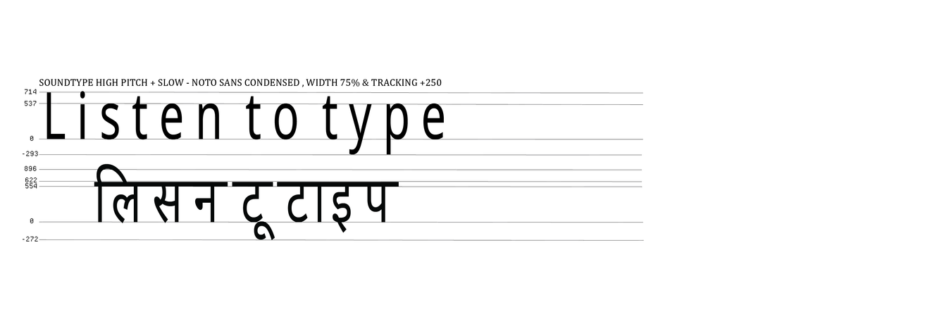
High Pitch → Extra Condensed Since high pitched sounds have shorter wavelengths, narrow, compressed letter forms were used. It is a extra condensed type structure which replicate the tight, fast oscillations of the high frequencies.

Low Pitch → Expanded Wide letterforms result from low frequency sounds, and low frequency sounds have long wavelengths. By expanding the letter spacing and horizontal proportions of characters it gives greater representation of the deeper and more resonant quality of low pitched speech.
Speed: Fast Speech → Fast Speech motion Inspired+ tight spacing Word blend usually means that the person is speaking too quickly and ending words together to give the sense of movement. Slightly irregular, playful typographic structure draws inspiration from comic book lettering where dynamic words have exaggerated slants as well as variations in stroke that are presented in fast speech.
Slow Speech → Increased Letter Spacing + Extended “Khanna” in Devanagari & Tracking (letter spacing) increases in the visual representation of slow paced speech by extending the horizontal strokes of Shirorekha (headline bar) in Devanagari letters while increasing tracking it in Latin characters. Therefore these modifications focus on drawn out articulation and an impression of pause between words.

_gif.gif)
Visualizing how we speak

In the SoundType project, spoken speech traits
are transformed into a visual typographic system.
The typeface captures traits like pitch, loudness
and speed, allowing users to see how words are said
not just what is said. Through interactive tools and
expressive design, SoundType turns speech into a
playful, accessible, and multisensory experience.
_gif.gif)

**recreated using headspace brand illustration

Wireframes
Preview of the site
hover over the tabs for a preview


HOME
MIC
PLAY
ABOUT
BTS


Applications
SoundType can enhance subtitles, speech therapy and digital storytelling by visually conveying how something is said not just what is said. It adds emotion, tone, and rhythm to written text. This makes communication more expressive, inclusive, and interactive.

Learning Curve
Learned how to design a type syster based on sound traits.
Gained experience in
coding interactive,
speech-responsive tools.
Balanced creativity with technical problem-solving.
Explored the power
of typography in multisensory communication.


.jpg)
).png)


